
ANIME 101 · PRODUCTION DESIGN · MUSIC · ICONIC BY MISTAKE FORMAT
Sleeping Beauty Design and Music: Eyvind Earle, Tchaikovsky, Widescreen Geometry, and a Movie That Refused to Look Soft
The trees are architecture. The score remembers a ballet. The colors keep fighting over who controls the princess. This movie did not become beautiful by accident.
Why this movie still looks expensive before anybody speaks
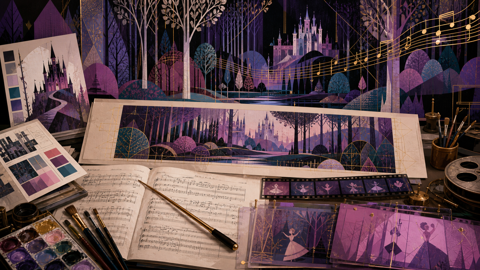
Sleeping Beauty announces its priorities through shape before dialogue gets a chance. Trees rise like cathedral columns. Castle walls flatten into illuminated manuscript panels. Crowds become patterned arrangements instead of noisy collections of bodies. Even the woodland animals seem placed by a designer who measured the negative space around every ear and tail. The movie wants a viewer to feel ceremony, distance, and danger through composition, then lets the characters move inside that controlled world.
That visual discipline explains why the film can feel colder than Cinderella and more imposing than Snow White. Softness appears in Aurora’s voice, the fairies’ domestic chaos, and the rounded movement of animals. The surrounding world refuses softness. Vertical trunks, sharp thorns, narrow windows, hard horizons, and long planes keep reminding everybody that this fairy tale has rules older than the people trapped inside them.
Eyvind Earle did not paint a generic fairy-tale forest
Eyvind Earle arrived at Disney in 1951 with a fine-art practice already behind him. The Walt Disney Family Museum credits him with styling and painting the key backgrounds for Sleeping Beauty and shaping character design and color decisions. Walt Disney wanted one visual intelligence holding the feature together. That level of control was unusual inside a studio built around collaboration among departments, specialists, and supervising animators.
Earle researched pre-Renaissance Gothic art, Persian miniatures, Asian art, and European painters including Van Eyck, Bruegel, Dürer, and Botticelli. Those influences do not sit on the screen like labeled museum samples. They become a production language: flattened distance, decorative foliage, precise silhouettes, jewel colors, deliberate asymmetry, and landscapes that feel designed rather than casually observed.
The background refuses to behave like background
Most viewers are trained to treat an animated background as the place behind the important action. Sleeping Beauty keeps challenging that habit. The environment competes for attention through detail, scale, and rhythm. A forest trunk may dominate half the frame. A castle may feel less like a location than an entire political order drawn in stone. Tiny characters cross spaces that appear to have existed for centuries before their entrance.
That choice irritated some animators because character performance traditionally deserved the clearest visual emphasis. Earle’s frames operate closer to unified paintings. People, architecture, animals, and landscape share one decorative system. The compromise required character designs and movement to respect hard verticals and graphic patterning without losing warmth or readability. The tension survives in the finished film, and the tension is productive.
Ten days for a background explains plenty
The Walt Disney Family Museum reports that a typical Disney background might take roughly a day while an Earle background could require as many as ten. Production continued for more than six years, with intense attention reaching drawings another feature might treat as minor. Every bramble, stone, branch, banner, and strip of color had to belong to the same severe visual world.
That labor is visible, but admiration should not become fairy dust sprinkled over the production process. A unified style means revision, disagreement, slow approvals, and artists adapting their own instincts to somebody else’s system. Beauty emerges from argument as often as inspiration. Sleeping Beauty looks singular because a large crew was asked to keep returning to a demanding singular idea.
Widescreen changed the grammar
Sleeping Beauty was presented in Technirama 70, giving the production a wide field that could hold ceremonial processions, deep forests, huge rooms, and long horizontal movement. Widescreen is not simply more picture added to both sides. Every entrance, gaze, cluster, and empty zone must be organized across a different visual sentence. A lonely figure can look lonelier. A royal court can look more politically arranged.
The format also creates room for the background to assert power. Aurora can occupy a small portion of an immense forest composition while still remaining legible through color and motion. Maleficent can take command through silhouette against open space. Phillip’s battle can move across layered obstacles without collapsing into visual noise. Scale becomes storytelling rather than decoration.
Verticals are doing emotional work
Earle’s forests are famous for tall, narrow trunks and branches that turn nature into architecture. Those verticals make the woods feel protected and watched at the same time. Aurora’s hidden home sits inside a place that shelters her, confines her, and keeps the truth of her identity beyond reach. The forest can be sanctuary and surveillance without changing locations.
The same vertical pressure follows the story into towers, spindles, spears, castle interiors, and Maleficent’s horns. Upward lines suggest aspiration, nobility, imprisonment, and threat depending on the scene. When the curse draws Aurora toward the tower, the movie has already trained the eye to associate height with power beyond ordinary human control.
Color is not mood wallpaper
The famous pink-and-blue argument turns color into comedy, but the whole film treats color as jurisdiction. Flora and Merryweather fight over who gets to define Aurora’s presentation. Maleficent owns sick green flame, black mass, and violet accents. The forest romance uses earth, teal, muted blue, and warm skin tones to separate private desire from palace ceremony.
Color changes tell viewers who controls the moment. Maleficent’s green often behaves like contamination, entering spaces that seemed stable. The fairies’ magic produces bright trails and domestic accidents. Royal scenes use controlled richness. Aurora’s final gown cannot remain one color because even the ending preserves a tiny argument about how the princess should be seen.
Aurora had to belong to the paintings
Tom Oreb’s character styling gave Aurora long vertical folds, graphic hair shapes, and a body designed to harmonize with Earle’s settings. A softer, rounder princess might have looked pasted onto those backgrounds. Aurora’s elegance therefore carries a slight distance. Her posture, profile, and controlled movement fit the courtly visual plan before she knows she belongs to a court.
That design does part of the identity plot quietly. Briar Rose wears peasant clothing, but the lines never fully disguise royal styling. She looks native to the woods and too formally composed for an ordinary village life. The secret is visible in the drawing even while the character remains unaware.
Maleficent wins the silhouette test
Maleficent can be recognized without facial detail because the design is built from decisive geometry: horns, high collar, long robe, staff, and sharp framing around the face. That silhouette lets her dominate wide compositions and survive changes in lighting. She does not need visual clutter because every major line points toward control.
The dragon transformation expands the same logic instead of replacing her with a random monster. Horns become larger, black mass fills more of the frame, and green fire externalizes the color language already attached to her magic. The climax feels earned because the movie has been teaching viewers to read Maleficent as a shape capable of swallowing space.
The three fairies are organized chaos
Flora, Fauna, and Merryweather use rounder bodies, brisk gestures, and distinct color coding. Their movement breaks the severe calm of Earle’s world. Domestic sequences work because the fairies are visually and behaviorally incapable of maintaining the perfection surrounding them. A cake collapses. A dress hangs badly. Magic sparks turn housekeeping into a territorial dispute.
Their comedy also protects the film from becoming a gallery tour. The backgrounds may be formal, but the women raising Aurora are petty, affectionate, stubborn, and practical. They carry most of the plot’s labor. The visual contrast between geometric world and bustling caregivers makes both sides stronger.
Once Upon a Dream arrived with a history
The melody associated with Once Upon a Dream comes from Tchaikovsky’s Sleeping Beauty ballet, especially the Garland Waltz material. George Bruns adapted themes from the ballet score throughout the film rather than treating one borrowed tune as a nostalgic ornament. D23 describes Bruns searching the score closely for material suited to scenes and songs.
That borrowing gives the romance a strange kind of memory. Aurora sings as if she recognizes a relationship before living the encounter. The audience may also recognize a melody older than the movie. Dream, musical quotation, and adaptation fold together. The song sounds destined because the tune already carries another Sleeping Beauty inside the current one.
George Bruns was translating, not copying
Adapting a ballet score for animated film requires more than shortening orchestral passages. Ballet music supports bodies performing choreography across a stage, while film music must follow cuts, dialogue, gestures, visual jokes, and changes of location. Bruns selected, reshaped, connected, and orchestrated Tchaikovsky themes for a new dramatic machine.
The Academy Award nomination for the score recognizes that transformation. The movie preserves the grandeur of Tchaikovsky while making room for character voices and cinematic pacing. A viewer can hear ballet ancestry without needing the film to stop and announce a music-history lesson.
Six-channel stereo was part of the ambition
D23 records that Bruns conducted recording sessions in Germany from September through November 1958, using advanced six-channel stereo equipment available there. The production wanted a sound field capable of matching the width and detail of the image. Orchestral scale was therefore a technical choice as well as an artistic one.
Modern home viewing can shrink that intention into television speakers or a phone. The score still carries melodic force, but the original presentation imagined music surrounding a wide screen. The film was built as an event. Restoring sound and image with care is not collector fussiness when scale belongs to the storytelling.
The movie moves like a ballet even when nobody is dancing
Aurora’s forest movement, court processions, fairy entrances, and the final dance all benefit from musical phrases that organize gesture. Characters often cross a frame with a measured clarity closer to choreography than casual acting. Even comic timing lands against a highly structured score.
The approach helps unite human movement with decorative composition. A random gesture could disturb the visual pattern. Choreographed motion activates the pattern. The viewer feels characters entering and leaving a designed rhythm, which suits a story about a curse with a precise birthday deadline and an awakening treated as fate.
Silence matters because the score is so rich
A lush orchestral world makes quieter passages feel exposed. Maleficent’s commands, Aurora’s approach to the spindle, and moments of waiting gain tension when musical abundance narrows. Sound design and score create space for dread instead of coating every second in sweetness.
The contrast also helps distinguish enchantment from ordinary life. Music can make a forest feel like destiny and then leave a room emotionally bare. The best sequences trust viewers to feel that withdrawal. Constant musical reassurance would weaken a film whose central promise is that danger can enter a protected childhood.
The medieval look is an argument, not a history lesson
Sleeping Beauty borrows manuscript illumination, Gothic architecture, heraldic pattern, court costume, and stylized landscape without reconstructing one exact medieval date. The film creates an art-history fantasy whose authority comes from consistency. A decorative tree need not be botanically realistic when every tree follows the same visual law.
Calling the imagery medieval should therefore remain broad and careful. The production combines periods and regions through mid-century design judgment. Accuracy was not the only goal. The goal was a world that felt old, formal, and unlike earlier Disney features while remaining readable to a 1959 audience.
The forest romance is staged as temporary freedom
Aurora and Phillip meet away from parents, courts, schedules, and political titles. The forest gives them room to improvise a relationship through song, embarrassment, pursuit, and recognition. Yet the composition never becomes loose. Trees, paths, and animals stage the encounter almost as carefully as a ballroom.
That contradiction suits the romance. Both characters believe they are briefly choosing outside royal obligation. The audience later learns the kingdom already arranged the same union. The forest feels free because nobody names the contract there. Design lets freedom breathe while the plot quietly closes the circle.
The castle celebrates order and exposes fragility
Royal architecture promises permanence, but one uninvited fairy can destabilize the entire system. The christening fills the hall with hierarchy, spectacle, gifts, and witnesses. Maleficent enters that arrangement and proves the ceremony cannot protect the child at its center.
Later, the sleeping court turns political order into a still life. Servants, rulers, animals, and objects freeze together. The same precise composition that made ceremony impressive now makes power look helpless. A kingdom can arrange bodies beautifully and still fail to keep one girl safe.
Thorns convert graphic design into violence
The thorn sequence takes the film’s love of decorative line and weaponizes the habit. Curves, points, repetition, and silhouette stop behaving like elegant border work and become an active barrier. Beauty and danger use the same design vocabulary. Maleficent does not import ugliness into the movie. She turns the existing visual order against the hero.
That is a better climax than a sudden switch into unrelated action aesthetics. Phillip fights through a world viewers already understand, only intensified. The thorns look inevitable because branches, verticals, and hard edges have surrounded the story from the beginning.
The dragon is graphic terror, not zoology
Maleficent’s dragon does not need plausible animal anatomy. The design must read instantly across darkness, flame, smoke, and widescreen movement. Heavy black shape, jagged contour, horns, eyes, and green fire produce a heraldic monster large enough to feel like the curse has taken physical form.
The scene works through contrast as much as motion. Phillip appears small against the creature and landscape. The fairies’ assistance becomes visible through bright magical intervention. Heroism is measured by crossing an image designed to overwhelm him.
The ending keeps arguing over pink and blue
After battle, awakening, reunion, and court restoration, Flora and Merryweather resume changing Aurora’s gown. The joke refuses total harmony. The kingdom may celebrate one marriage, but the women responsible for saving the story still disagree about presentation. Their argument literally alters the princess while she dances.
That final flicker can be read as harmless comedy and as a tiny reminder that Aurora remains somebody other people style. The film closes on romantic elevation while color control stays unresolved. A perfect fairy-tale ending contains a very familiar family squabble.
Why the film disappointed before becoming sacred
D23 notes that Sleeping Beauty exceeded a six-million-dollar budget and was not an initial box-office success. Lavish production does not guarantee immediate cultural agreement. Audiences can admire beauty and still feel distance. Studio economics can judge an experiment harshly before reissues, home video, restoration, merchandise, and critical attention build another reputation.
That history should temper the lazy claim that classics arrive already crowned. Sleeping Beauty became unavoidable through time. The same design choices that may have seemed severe or expensive became the reason later viewers separated the film from surrounding animation.
Restoration can rescue detail and invent a new memory
A carefully restored version can recover color relationships, line clarity, texture, and widescreen information lost in faded prints or cropped television broadcasts. Restoration also asks interpretive questions about saturation, contrast, grain, framing, and sound. Viewers who first meet a pristine digital edition may assume the movie always looked exactly that way.
Home-video history changes criticism. A cropped pan-and-scan copy weakens Earle’s horizontal compositions. A dim transfer buries color design. A compressed stream flattens music. Format is part of access, and access shapes what people think the artwork accomplished.
The production influenced fantasy far beyond princess films
Earle’s patterned forests, monumental silhouettes, and color blocks echo through animation, illustration, theme-park design, fashion, and contemporary fantasy art. Influence does not require direct imitation. Artists inherit permission to let backgrounds become assertive, decorative, and emotionally controlling.
The movie also remains a warning about style systems. A strong visual concept can unify a project and create friction with performance specialists. Later productions keep negotiating that balance between art direction and character animation. Sleeping Beauty made the negotiation unusually visible.
How to watch the design without forgetting the story
Pause on a frame if the mood strikes, but also watch how compositions change across movement. Notice where Aurora sits inside the frame, how Maleficent enters negative space, when the fairies break symmetry, and how the camera uses distance. Background appreciation becomes richer when connected to character pressure.
Listen for Tchaikovsky themes as dramatic material rather than prestige wallpaper. Ask what Bruns changes when dialogue arrives, comedy interrupts, or danger accelerates. The production design and score are not separate museum rooms. They keep negotiating the same question: how can an old fairy tale feel inevitable and newly made at once?
Easter eggs worth carrying into a rewatch
Look for the vertical lines worked into Briar Rose’s clothing so her figure belongs with the forest. Watch the animal dance partner mimic Phillip’s costume silhouette. Track green as Maleficent’s magical signature. Notice how the final clouds and elevated dance turn romance into a literal departure from architecture.
Listen for the Garland Waltz ancestry inside Once Upon a Dream and for ballet material reshaped around film action. Compare the domestic cottage scenes with palace ceremony. Count how often a doorway, trunk, tower, or curtain frames a body. None of these receipts requires a conspiracy board. The movie leaves its design decisions in plain sight.
The final RaeRae receipt
Sleeping Beauty is not emotionally deep because every character receives enough dialogue. The film is deep because visual and musical systems keep saying more than the screenplay can fit. Aurora’s lack of narrative control lives inside a world obsessed with arranging her. Maleficent’s power lives in the way space changes when she arrives. The fairies’ love lives in messy movement against impossible perfection.
That does not excuse thin characterization or turn every gorgeous frame into moral brilliance. Beauty can hide absence. Craft can support a limited story. The honest response holds both truths at once: Disney made one of the most controlled animated worlds ever placed on a screen, and that world remains interesting partly because the control feels beautiful, oppressive, funny, and fragile in the same breath.
Sources and credits
Production history and credits were checked against the Walt Disney Family Museum’s Eyvind Earle feature, the D23 Sleeping Beauty film archive, the D23 production-facts feature, and the D23 George Bruns biography. Commentary and close reading are original CVM Sekai editorial analysis.
Keep exploring
Return to the Sleeping Beauty hub for reviews, character profiles, rants, and the rest of the guides.