
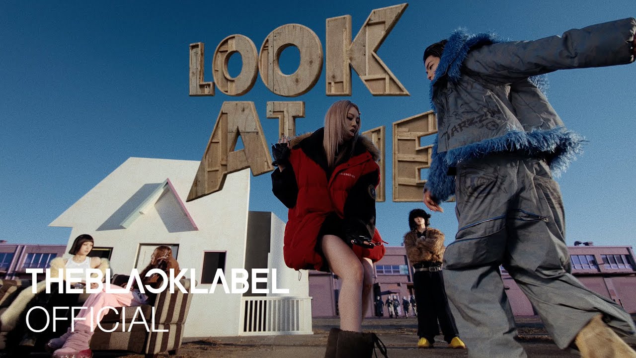
LOOK AT ME
ALLDAY PROJECT put a playground chant in designer chains, built a better pre-chorus beside it, and dared everybody to complain while repeating the group name exactly as planned.
Bottom line: The pre-chorus is better than the chorus. Youngseo knows it. I know it. The producers probably know it too. The chorus still lodged itself in my head like a child who learned one sentence and plans to use it for the next six hours. That is both the song’s problem and its business model.
Best musical choice: Youngseo’s melodic pre-chorus opens the whole track.
Best visual idea: Attention becomes rooms, lenses, signs, crowds, and vertical movement.
Biggest waste: Woochan has the sharpest rap foundation and not enough space.
Main complaint: The final chorus repeats the plan instead of raising it.
What changed every time I replayed it
First listen: Did they just put the letters A, D, and P into a nursery-rhyme chant and dare me to object while the bass was playing? Yes. The song introduced the marketing plan before it introduced much melody.
Second listen: Youngseo reached the pre-chorus, the production opened, and the track suddenly remembered air, tension, and desire. Then it marched straight back to the chant. I laughed because the better song appeared for a few seconds and left its coat by the door.
Third listen: The member differences became the real engine. Five voices attack attention from five directions: technical rap, cool texture, sharp bite, dance-trained control, and melodic lift.
Fourth listen: The video changed the chorus from thin writing into a visual thesis. Surveillance, spectacle, framing, crowds, signs, and stunts make “look at me” feel like an environment rather than one repeated demand.
Fifth listen: I still wanted a stronger final escalation. I also caught myself chanting the initials while criticizing the chant. Congratulations to the marketing department, I suppose.
Confidence as a camera command
“LOOK AT ME” does not ask for permission. Its lyrics move through watches, investments, profit, designer cars, chains, camera angles, and the repeated group initials. ALLDAY PROJECT sell themselves as the object that makes the room reorganize.
The core idea fits on a flash card: you are looking because they are worth looking at. Annie, Bailey, Tarzzan, Woochan, and Youngseo helped write their parts, so the flexes also act as introductions. Nobody arrives pretending humility is the brand.
The best little construction is the count. A 4×4 leads to five members, a sixth sense overflowing, and one-of-one status. It is goofy, tidy, and useful. A chant song needs small internal games because the chorus does not carry much information. The numbers give listeners something to catch after the slogan has already landed.
There is also a sharper idea under the jewelry. Attention now behaves like currency. If the camera sees you, the feed values you. If the feed values you, brands, crowds, and money follow. The song treats visibility as proof of importance because pop culture often does exactly that.
That makes the bragging less random than it first appears. Watches and cars do not simply announce wealth. They provide evidence that attention has already converted into material value. The lyrics make fame sound like an investment portfolio with choreography.
Yes, the chorus sounds like a nursery rhyme
Listeners noticed immediately. The melody uses the logic of a playground chant: short phrase, easy notes, group name, repeat until surrender. Some people hear childish writing. Others hear efficient branding. Both groups heard the design correctly.
Producers 24, JuniorChef, and Nick Spiders leave space around the chant so it can travel. Ten seconds would work in a dance clip, a stadium, a commercial, or an edit. You do not need the verse, the translation, or even the title. You need the letters and the rhythm. That is useful pop engineering, even when it is not satisfying songwriting.
My problem is not that the chorus sounds childish. Pop has borrowed from playgrounds forever because children understand memory before advertisers give it a focus-group name. My problem is that the verses do not always earn how little the chorus gives back. A hook this bare needs verses packed with personality, rhythmic surprise, or both.
The low, rubbery bass keeps the track from becoming weightless. Stripped percussion leaves room for the voices to define each section. That works when the member has a strong pocket or distinct tone. It exposes the writing when a flex line depends more on styling than rhythm.
The final minute is where the arrangement owes me money. The writers found a genuinely good melodic doorway in the pre-chorus and used it mainly to escort us back to “look at me, ADP.” One altered chant, extra harmony, rap handoff, or bass mutation could have made the last return feel like a payoff. Instead, the track repeats its business card.
Why the pre-chorus is the real hook
The pre-chorus stretches the melody and creates anticipation. The production opens. Youngseo pulls the listener upward. For a moment, the song stops displaying confidence and reveals the desire underneath it. “Show me” sounds like a challenge, but it also sounds like somebody waiting to see whether the promise will be answered.
That glimpse of vulnerability matters. Pure bragging gets flat because it has nowhere to move. Desire gives confidence a target. Youngseo does not weaken the song by introducing need. She gives all the surrounding flexes something human to protect.
Then the chant drops with more impact because we briefly visited a place with harmonic air. That structural contrast proves the chorus can work. It also proves the song had room for one more melodic idea and chose not to use it.
Five people, five ways to demand the frame
Youngseo wins the arrangement. Her pre-chorus adds lift, control, and actual longing to a song mostly concerned with being watched. She turns a slogan into a dare. Every return reminds me that one strong melodic decision can reorganize an entire track.
Woochan is underused. He has the clearest technical rap foundation in the group. His pocket brings relief whenever the song confuses cool delivery with sufficient writing. The investment verse has teeth because he sounds like he understands both the rhythm and the argument. I wanted another full section.
Tarzzan fits this production better than some of the harsher reactions admit. The laid-back beat gives his tone room. He is not supposed to outrap Woochan. His job is texture, posture, and the kind of ease that makes the camera come closer. Here, that job makes sense.
Annie‘s tone will divide people. Some hear distinctive bite. Others hear a nasal or flat delivery. I hear both depending on the line. Her sharper voice cuts through the soft instrumental, but not every flex lands with the weight the lyric requests. Distinctive does not automatically mean effective in every pocket.
Bailey keeps proving that “the dancer” was an incomplete label. Her vocal and rap fill-ins glue the mixed-gender tones together. She understands physical rhythm, so even brief lines feel placed rather than assigned. The camera also trusts her with movement because she can finish an idea through her body after the lyric ends.
The mixed-gender lineup helps the song because a simple chant needs contrast. Five nearly identical tones would make the hook feel smaller. ADP can pass the same demand through different textures, which keeps the repetition from collapsing immediately.
The video turns attention into architecture
Director and writer Rima Yoon builds the visual world around surveillance, spectacle, framing, display, and escape. The members get watched, presented, bounced, chased, and centered. Rooms look as if an algorithm designed them after studying celebrity without understanding human scale.
The brown and cream palette drew complaints for looking dull. I think it does more than decorate the frame in beige. It makes the styling and movement feel like expensive objects inside an institutional space. The video looks less like a party and more like a controlled experiment in being noticed.
Trampolines and sudden vertical motion literalize the group rising above the people around them. Wide lenses distort rooms and bodies. Repeated signage turns ADP into both a name and an instruction. The camera does not simply document attention. It becomes the force applying it.
RIGEND fills the frame with stunts, beam projection, practical movement, typography, crowds, and VFX. When the lyric says “camera, action,” the video has already spent two minutes obeying. The production team gives the thin hook an entire visual grammar.
That grammar also has a darker edge. Being the center of attention looks powerful until every room starts behaving like a display case. The members control the frame, but the frame keeps following them. Fame offers power and surveillance in the same package, then asks the artist to smile for delivery.
Easter eggs and details worth pausing
- The 4, 5, 6, 1 sequence: A 4×4, five members, sixth sense, and one-of-one status create a compact identity roll call.
- ADP signage: The initials repeat until the group itself becomes a product logo. The chorus works like an advertising jingle because the video treats the name like a brand.
- Camera language: Angles, eyes, action, and watching connect the lyric to the visual design. The song asks for attention while the video asks who controls it.
- Vertical movement: Trampolines and lifted bodies turn rising fame into a physical gag, but falling always remains possible.
- The ecosystem-destroyer line: Woochan frames the group as an invasive force nobody knows how to remove. Dramatic? Yes. Proper idol-rap exaggeration? Also yes.
- AI in the production credits: The published visual credits include an AI artist among a much larger VFX team. That deserves clear disclosure because digital spectacle still depends on human labor, consent, and authorship.
The macro view: fame as product placement for the self
At a global level, “LOOK AT ME” understands that pop groups now debut inside an attention economy, not only a music industry. A song competes with clips, memes, brand campaigns, edits, reaction videos, and five-second scroll decisions. The chant prepares for that world. It can break away from the full track and still advertise ADP.
That is clever and a little depressing. Music once sold the star. Now the star, the clip, the outfit, and the controversy may sell the music in any order. The group name becomes the most portable lyric because recognition itself is the commodity.
The video visualizes that machinery without fully criticizing it. ADP look powerful inside the spectacle. They also look processed by it. The rooms, lenses, and crowds turn people into high-value images. That tension gives the video more depth than the chorus offers on its own.
The personal and interpersonal view
On a personal level, the song catches the thrill of deciding you deserve the frame before everybody agrees. Confidence sometimes needs to arrive before evidence. Otherwise, nobody auditions, applies, publishes, performs, or starts.
On an interpersonal level, “look at me” can mean two opposite things. It can be a healthy refusal to disappear. It can also become a demand that everybody else serve as an audience. The members sell the first meaning, but the luxury flexes flirt with the second.
My RaeRae read is that attention should be a tool, not proof of worth. A million eyes can still misunderstand you. One honest person can see you clearly. Buddhist thought warns against attachment, and the feed offers attachment with analytics. The song enjoys the numbers. The video quietly shows the cage built around them.
What works
- Youngseo’s pre-chorus gives the song melodic lift.
- The bass keeps the chant from floating away.
- Five distinct tones make repetition more bearable.
- Woochan’s verse brings technical weight.
- The video builds a complete theory of attention.
What gets my side-eye
- The chorus gives branding more than songwriting.
- Woochan needed another full rap pocket.
- Several flex lines feel underwritten.
- The final return should evolve.
- AI credit requires visible transparency, not a buried line.
RaeRae verdict
“LOOK AT ME” is a clever brand exercise attached to a song that needed one more musical idea. The pre-chorus is excellent. The bass behaves. Several rap sections work. The video turns a thin hook into a complete visual thesis.
I understand the people who hate the chant. I also understand why the label chose it. You can complain after one listen, but you will complain using the exact melody they wanted you to remember.
Replay level: Medium, with involuntary spikes.
Best part: Youngseo’s pre-chorus and the video’s controlled chaos.
Biggest complaint: More Woochan, plus a final chorus that changes shape.
Final diagnosis: A nursery rhyme wearing designer chains. It looks expensive. I still checked the clasp.
Credits and receipts
Songwriters: 24, Annie, Bailey, Jesse Bluu, Kush, Malachiii, Tarzzan, Teddy, Vince, Woochan, Youngseo, Zikai · Composers: 24, Jesse Bluu, Kush, Malachiii, Zikai · Producers: 24, JuniorChef, Nick Spiders · Director and writer: Rima Yoon · Production: RIGEND · Director of photography: Jinhyuk Lee · Production designer: RAMI.