
ANIMATION 101 · ALADDIN PRODUCTION DESIGN · THE CITY WAS NEVER “JUST FANTASY”
How Aladdin Built Agrabah: Persian Miniatures, Arabic Calligraphy, Color, and the Designs Disney Mixed Together
Agrabah came from real research, multiple artistic traditions, old Hollywood habits, and a whole lot of decisions the word “fictional” cannot magically erase.
Agrabah looks familiar because the design pulls from several places at once
Aladdin never gives Agrabah a real location on a map. The city reads as Arab, Persian, South Asian, and Hollywood fantasy in the same frame. Domes and minarets sit beside palace shapes that many viewers associate with the Taj Mahal. Marketplaces borrow the visual shorthand of older adventure movies. Clothing, names, accents, music, and decorative patterns travel across regions without stopping to announce where one influence ends and another begins. That mixture helped the film feel instantly legible to a Western audience in 1992. It also created the cultural blur that people have been arguing about ever since.
Calling Agrabah fictional does not make those choices culturally neutral. Fantasy still selects recognizable architecture, language, bodies, and histories. A viewer may not know the name of Isfahan, the structure of a Persian miniature, or the logic of Arabic calligraphy, but the production design can still teach them what the movie thinks a generalized “East” looks like. The pleasure of the color and movement exists beside that responsibility. I can love the Cave of Wonders opening its mouth and still ask whose visual traditions were combined to make the spectacle work.
The Walt Disney Archives has described Persian miniatures and Arabic calligraphy as major references for the film. Layout supervisor Rasoul Azadani photographed architecture in his hometown of Isfahan, Iran, and those research images fed the production team. That evidence gives us something firmer than guessing from a screenshot. Agrabah was designed through observation, stylization, animation history, and inherited Hollywood fantasy. Every layer left a mark.
Rasoul Azadani brought Isfahan into the production room
Azadani reportedly produced roughly 1,800 photographs during a research trip to Isfahan. The number matters because it pushes against the idea that the background artists simply doodled an imaginary desert city. They gathered doors, streets, courtyards, arches, tile, rooflines, and the proportions of lived architecture. Those photographs became working references for layouts rather than a tourist slideshow added after the decisions were finished.
A layout artist controls more than pretty scenery. Layout establishes the camera position, the spatial relationship between a character and a room, the route an action can take, and the amount of world visible around a performance. Aladdin sprinting through Agrabah depends on streets that can fold, drop, narrow, and suddenly open. Jasmine’s palace confinement depends on rooms whose scale makes her look protected and trapped at the same time. The architecture carries story before anybody explains the politics.
Isfahan does not become Agrabah in a documentary sense. The artists translate selected forms into a graphic language that fits caricatured characters and musical timing. Translation can preserve a structural insight while shedding local specificity. It can also turn a real place into raw material for fantasy. Both things happen here. The research made the city richer, while the finished film still declined to name most of the cultures supplying that richness.
Persian miniatures taught the film how to flatten and decorate space
Persian miniature painting often organizes space differently from Western single-point perspective. Architecture can open toward the viewer, patterns remain intensely visible, and multiple zones of action coexist inside one composition. Aladdin does not imitate miniature painting literally, yet its backgrounds repeatedly favor silhouettes, decorative surfaces, stacked spaces, and readable shapes over strict realism. Agrabah can feel like a storybook page that learned to move.
That influence is especially useful in the marketplace. A realistic city might swallow the characters in visual noise. The animated city needs awnings, stairs, towers, baskets, fabric, guards, animals, and crowds to read within seconds. Graphic simplification lets Aladdin leap through a dense world without disappearing inside it. The viewer always understands the next obstacle even when the street itself would make no engineering sense.
The palace uses decoration differently. Open courtyards, polished surfaces, fountains, pale stone, and repeated arches advertise wealth through order. The market is crowded with survival. The palace is crowded with rules. Jasmine has physical room and very little freedom. Aladdin has physical danger and constant movement. Their environments make the class conflict visible before the romance asks them to cross it.
Arabic calligraphy influenced movement even when the movie was not writing words
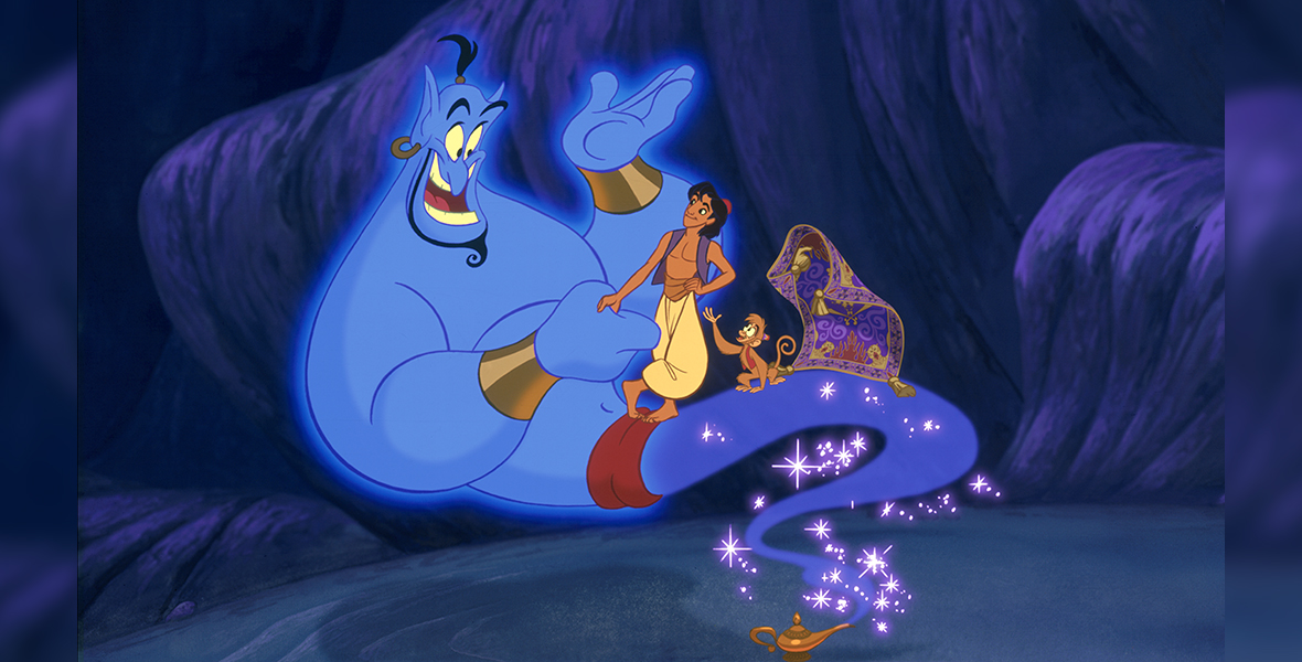
The Archives also points to Arabic calligraphy and its curved, elegant lines as a reference. That influence appears less as readable text than as a philosophy of contour. Bodies, smoke, cloth, clouds, palace forms, and magical transformations sweep through long curves. The Genie can change shape without losing the rhythm of a continuous line. Jafar’s narrow design can bend like a hook before snapping into a rigid threat.
Eric Goldberg’s Genie animation famously drew on caricaturist Al Hirschfeld, whose lines stretch, curl, and compress a personality into motion. The calligraphic and caricature traditions are not interchangeable, but the film places their love of expressive line in conversation. Genie becomes the place where graphic design, performance, celebrity impressions, and animation metamorphosis all move faster than the plot can contain them.
There is a tricky boundary here. Saying a line looks “calligraphic” can become an empty compliment if the actual writing tradition disappears. Arabic calligraphy is an art with scripts, rules, religious histories, regional practices, and skilled labor. The film borrows the visual energy of curves without teaching any of that structure. A responsible guide can identify the production reference while refusing to pretend the movie gave viewers a lesson in the art itself.
Color tells us who controls a room
Production designer Richard Vander Wende and the art team used color as emotional organization. Blue tends to accompany safety, loyalty, possibility, and the Genie’s most generous presence. Red and acid gold gather around Jafar’s control. These associations are broad enough to understand immediately, but the film makes them spatial. When Jafar takes power, the throne room does not merely contain a villain in red clothing. The whole room changes allegiance.
The transformation exposes an important feature of palace power. The architecture serves whoever controls the image of authority. The Sultan’s rounded blue and gold environment makes rule look harmless, soft, and childish. Jafar’s version makes the same institution look violent. Jasmine experiences the palace as a cage under both palettes. The degree of danger changes, but her political life remains controlled by men who think choosing her future belongs to them.
The Cave of Wonders uses darkness and concentrated gold for a different kind of control. Treasure attracts the eye while the cavern withholds spatial certainty. Abu sees the jewel because the color script makes greed brighter than caution. Aladdin’s later Prince Ali parade reverses the tactic in daylight. Gold, fabric, animals, and bodies create so much visual wealth that the performance tries to bury the insecure boy directing it.
Shape language makes the cast readable before they speak
The Sultan is built from circles and an egglike body. His palace echoes those curves. Jafar is long, pointed, and vertical. Aladdin is agile and wedge-shaped, able to fold into the angles of streets and rooftops. Jasmine’s hourglass design is echoed in elements of her room. Genie refuses to stay one shape long enough to belong to a fixed category. These choices make personality visible at animation speed.
Shape language is effective, but character design also carries beauty standards and stereotypes. Aladdin and Jasmine receive features calibrated for romantic identification. Many guards, merchants, and comic men receive broader noses, heavier accents, missing teeth, and bodies designed as threats or jokes. The visual system asks audiences to identify the most conventionally attractive characters as the emotionally modern people in the room.
Jafar complicates that pattern because his elegance is part of his menace. His design is controlled, theatrical, and deliberately seductive before it becomes monstrous. He resembles a blade wearing expensive fabric. The film lets him be visually sophisticated while coding his ambition, voice, body, and gestures as dangerous excess. Reading him only as a great villain design misses what the design teaches about respectable rulers and suspicious outsiders.
The Cave of Wonders is a mouth, a threshold, and a class test
The tiger head rising from the sand is one of the film’s cleanest design ideas. A landscape becomes an animal and an entrance becomes a judgment. The cave speaks with institutional certainty: only the diamond in the rough may enter. That phrase pretends worth can be recognized perfectly while powerful men wait outside to exploit the person selected. It sounds like destiny and functions like recruitment.
Inside, the cave is less a geographic place than a moral obstacle course. The immense treasure field makes one forbidden object feel impossible to avoid. Carpet introduces warmth and personality inside a structure designed to punish desire. Abu’s mistake triggers collapse, but Jafar designed the entire situation around coercion. The visual spectacle can make the victim’s small failure look larger than the adult scheme that placed him there.
The escape sequence turns layout into panic. Stable paths disintegrate, vertical drops replace horizontal travel, lava cuts the frame, and the cave’s decorative richness becomes lethal debris. Aladdin survives because Carpet and Abu are partners, not accessories. Jafar waits at the exit and treats rescue as a transaction. The sequence explains his politics more clearly than any speech: other lives are useful while they are carrying something he wants.
Agrabah’s beauty cannot settle the representation argument
The film’s defenders often point to the research, craftsmanship, and beloved characters. Its critics point to cultural blending, lyric history, accent choices, racial coding, and the fantasy of a region presented largely through danger, luxury, despotism, and spectacle. Those positions do not cancel each other. Meticulous artists can make beautiful work inside a system of choices that deserves criticism. Affection is not an exemption from analysis.
The opening song became one of the clearest examples. Disney changed a lyric after objections to its violent description of the region. Later versions changed additional wording. That history proves the film was never a sealed artifact floating outside public response. The studio adjusted what it considered indefensible while keeping the musical identity audiences recognized. Representation arguments affected the text itself.
Agrabah also became more than the original feature. Sequels, a television series, games, stage productions, parks, merchandise, and the 2019 remake kept revising the city. Each branch inherits the 1992 design while deciding what to clarify, soften, expand, or ignore. “Canon” cannot solve the cultural question because repetition can normalize a design choice without making it accurate.
The 2019 remake made the city busier and the politics more explicit
Live action adds textiles, crowds, physical sets, regional casting questions, and a stronger sense of a port city connected to trade. Jasmine receives political ambition beyond refusing a husband. Dalia gives her a relationship inside the palace that does not revolve around a suitor or father. These additions answer real absences in the animated film, even when the remake remains tied to the same fantasy geography.
More detail does not automatically produce more truth. A production can hire culturally varied performers and build elaborate markets while still combining influences for an imagined place designed to be legible to a global Disney audience. The remake makes the mixture look materially plausible. It does not turn Agrabah into a real country. Viewers should notice both the expanded texture and the continued blur.
The comparison also shows what animation was doing on purpose. The 1992 movie can bend a skyline, flatten a crowd, or transform a body on the beat because its world is graphic. Live action has to make the same musical exaggeration coexist with gravity, cloth, skin, and architecture. Neither approach wins by default. They reveal different compromises behind the fantasy.
How to read the design without turning fandom into homework
Start with what the frame makes you feel, then ask how it produced the feeling. Does the palace seem safe because the colors are pale, or controlling because the gates never stop framing Jasmine? Does Prince Ali look joyful, desperate, or both? Does the marketplace feel alive while its unnamed residents remain background machinery? The questions grow from watching rather than replacing it.
Separate production evidence from fan inference. Disney’s own archival discussion identifies Isfahan photographs, Persian miniatures, Arabic calligraphy, color planning, and specific animation influences. Those are documented references. A claim that one building “is” a particular mosque or that one costume represents an entire culture needs stronger evidence. Precision protects the cultures being discussed and makes the criticism harder to dismiss.
Most of all, let the contradictions stay visible. Aladdin is dazzling, funny, emotionally effective, formally inventive, culturally mixed, commercially calculated, and sometimes careless with the people whose worlds supplied its beauty. Loving the movie does not require sanding off any of those facts. Fandom gets more interesting when the receipt and the feeling can sit on the same page.
Receipts and further reading
The production-history details in this guide are grounded in the Walt Disney Archives feature “You’ll Always Be a Prince to Me: 30 Years of Aladdin” and Disney’s official 1992 film page. The first documents the Isfahan research, Persian miniature and calligraphic references, color planning, and character-design process. The second supplies the official film credits, release information, and Disney’s current character descriptions.
Return to the Aladdin hub for films, characters, reviews, rants, and the rest of the Agrabah research trail.
Agrabah design receipts that belong beside the spectacle
The production design becomes more legible when individual sources are named instead of folded into a single word such as exotic. Domes, courtyards, textiles, miniature-like framing, calligraphic shapes, market architecture, desert panoramas, and palace ornament do not come from one interchangeable culture. The film recombines visual cues for speed and fantasy. The guide can appreciate the result while still refusing the suggestion that beauty cancels the politics of mixture.
The title change to the opening song after criticism is part of the design history because sound teaches the audience how to read an image. A dazzling skyline lands differently when the lyrics introduce the imagined place through violence and foreignness. Revision does not erase the first release, and later editions do not make the original choice irrelevant. The record should preserve what changed, why people objected, and what the studio decided counted as repair.
The 2019 film adds physical sets, embroidery, crowds, and a cast with varied backgrounds, yet added texture cannot resolve a fictional geography built from deliberate blur. The remake makes Agrabah feel more materially inhabited and gives Jasmine a political constituency. It also inherits the commercial need for immediate recognition. The useful comparison asks which details become more specific, which remain decorative, and which new choices create a different problem.
How to use this receipt
How Aladdin Built Agrabah: Persian Miniatures, Arabic Calligraphy, Color, and the Designs Disney Mixed Together should help a reader notice the difference between a recurring franchise claim and evidence that appears in one branch. The feature, sequels, television series, stage adaptation, and remake do not share every rule or priority. When this guide moves between them, it names the version instead of smoothing contradictions into a false universal. That small habit prevents a convenient scene from becoming proof of how the entire franchise supposedly works.
What the short answer leaves out
How Aladdin Built Agrabah: Persian Miniatures, Arabic Calligraphy, Color, and the Designs Disney Mixed Together has a clean practical answer, but the clean answer should never erase the people, production choices, and cultural arguments underneath it. The final note keeps that tension visible. Readers can find the order, rule, or design reference quickly, then stay for the part that explains why the answer changed, who benefits from the accepted version, and which question the franchise still has not resolved.
Reading Agrabah one design choice at a time
The skyline cannot answer the cultural question by itself. The palace silhouette recalls the Taj Mahal strongly enough that many viewers read South Asia before a character speaks, while the story names an Arabic city and borrows market, costume, musical, and decorative signals from a much wider region. The collision is not a hidden mistake discovered by overly serious adults. It is the visual strategy. Agrabah was built to feel instantly legible as a generalized fantasy East, and that legibility depends on audiences recognizing fragments without being asked to locate them precisely.
Calligraphy deserves separate attention because letterforms can become atmosphere when viewers are not expected to read them. A curve that resembles Arabic script may be used as texture, logo, or magical ornament while its linguistic function disappears. The guide should distinguish actual writing from calligraphic suggestion and avoid claiming a source that the frame cannot support. Respect begins with admitting when design borrows the authority of a language without carrying a readable sentence.
Color performs moral sorting throughout the film. Jewel tones, desert gold, palace white, Jafar’s red and black, and the blue of Genie create immediate emotional categories. Those choices are effective, but effectiveness can inherit older visual codes about purity, danger, wealth, and foreignness. Looking closely does not require pretending every hue contains a conspiracy. It requires noticing when costume and lighting repeatedly tell us whom to trust before conduct has earned the judgment.
The market is where design and class meet. Crowded stalls, hanging fabric, food, guards, and compressed pathways make Agrabah feel alive while also turning poverty into kinetic spectacle. Aladdin knows routes through the city that palace residents do not, yet the film rarely pauses with the workers whose labor fills the frame. Production design gives them objects, color, and movement without granting sustained interiority. The beauty of the sequence and the thinness of its social map are both part of the receipt.
A better design conversation names the artists and constraints as well as the influences. Layout, background painting, character design, effects animation, color styling, and music solve different problems under one studio pipeline. No single contributor authored every cultural mixture on screen. Credit should be specific enough to avoid treating Disney as one mind, while accountability should remain broad enough that corporate approval and marketing are not erased behind individual craft.